In this blog-post I will try to introduce the different approaches on how to create more standardized dashboards for distribution across your organization. Reading this will not solve all of your problems, but I believe that it can lessen them to a large extent. But I would always recommend that you test of your dashboards across devices and screens-sizes before distribution.
Before building the dashboard
1) Think About the Purpose and The Users
Initially, you should think about the purpose of the dashboard – is the dashboard intended for management-presentations on large screens, is it only intended to be looked at from a desktop, or does it have to be read on every device and all staff.
##### **2) Sizes – Start Smallest Possible**
When it comes down to designing dashboards, there is not one optimal solution. The design is highly dependent on the purpose that the dashboard needs to fulfill.
When building dashboards, there exists three possible formats:
Fixed, Automatic and Range

Fixed – One Size Only
A fixed-size dashboard will remain the same size regardless of the display-window. If the dashboard is larger than the display-window, it becomes scrollable. If it is smaller, white space appears around it.. Use this size if you know that your dashboard will only be read in one size, e.g. only on desktops.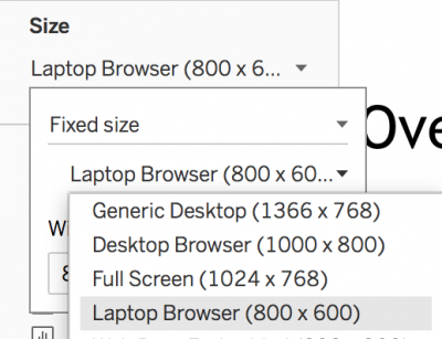
Range – Designed to Fit Full Screen, Within User-Specified Range
A range-sized dashboard has a specified minimum and maximum screen size that the dashboard can adjust within. This means that the dashboard utilizes full screen mode, but avoids adjusting to very large/small screens out of the range. It is important to remember to develop your dashboard in the same size as the specified minimum of your range.
In case the screen is bigger than the specified maximum, whitespace will appear around the dashboard. Contrary the dashboard will have scrollbars if the screen is smaller than the specified minimum. This is illustrated below.
Larger Than Maximum
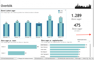
Smaller Than Maximum
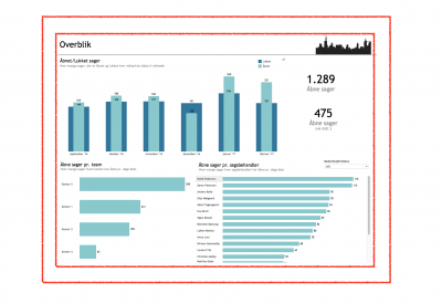
Initially, creating your dashboard in the minimum size is a good way of securing, that you can scale up your laptop-dashboard to a desktop-friendly version. This is what we call the Laptop/Mobile First approach.
Automatic – Quickly Adjustment to Full (Large) Screen
An automatic-sized dashboard will automatically scale your dashboard to fit the current display-window. This is an easy way to scale a dashboard from a laptop to larger screens. BUT – remember the Laptop/Mobile First approach.
If you do not initially design your dashboard in the smallest wanted readable view – going to an even smaller display-window, tend to make your dynamic sized dashboard of no use.
Notice, that automatically adjusting a dashboard that was created to fit a desktop-screen, to a large screen for presentation, might result in disproportional sizing of the visualizations and their headers, labels and/or legends. Solutions for these problems are explained below. Thus, I would not recommend using the automatic sizing of dashboards.
Device Specific – To Fit All Devices
To ensure that your dashboard looks great on tablets and smartphones aswell, you can use device specific dashboards. All you have to do is to layout your device specific dashboards and Tableau automatically detects, which device is viewing the dashboard.
You can use either range- or fixed-size when creating the initial dashboard. When you have finished your dashboard, you can go to the Device Preview and readjust you dashboards to be shown in both tablet and mobile layout. If using range remember to develop your device specific dashboards on the smallest size in your range.
When formatting the layout of your dashboard to fit phones and tablets, it is recommended to redesign the dashboard. It is often impossible to fit all the sheets from your original view to fit the smaller screen. Therefore, it is recommended to show only the most relevant visualizations.
If displaying all sheets from your initial dashboard is required, it is suggested to use Fit Width within each device added. Hereafter, you can construct a long-format dashboard that utilizes scrolling on both phone and tablet. This gives the viewer a more intuitive and easily readable dashboard. When designing for phone and tablet – it is advised to redesign every dashboard in the devices’ slimmest format. If you are interested in a good introduction to constructing long-format dashboards watch this video: https://www.youtube.com/watch?v=z3Il57LrEwg&t=529s
Here is a small walk-through of how to add different devices:
Click the Device Preview button as shown below.
Device Preview

Here you can modify the dashboard to fit all devices. You are presented with a preview of the device-size of the dashboard (shown by the box in yellow on the picture below). This makes you capable of fitting your dashboard to the intended devices. You can change the device type by clicking Device Type and when you know which device type you need, simply press Add Device Layout.
Device Type & Add Device Layout

When you publish a dashboard with multiple devices added to Tableau Server, the user will be presented with the specific dashboard layout intended to fit the current device that he or she is using.
##### **3) Dashboards for Large-Screen Presentations**
If your intended goal is to present a dashboard on a large screen, for many people to see – it is recommended, that you create a dashboard that utilize all the available space on the big screen.
When you display range- or automatic-sized dashboards, that was constructed on a smaller screen-size than the one for actual presentation – numbers and headers usually tend not to increase (or not increase proportionally) to the visualizations. Of this reason, we advise you to create (modify) your dashboard to fit the size of the big screen.
Building the Dashboard
4) Tiled or Floating – Depends on What You Are Trying to Accomplish
When you have settled on a dashboard size, you should start thinking about how to build your dashboard in order to make it adjust to your needs. Your dashboards are built from the worksheets you have created, including their respective objects such as filters, legends, etc.
In general, we work with two types of object-behavior: Tiled and Floating. What behavior to choose, greatly depends on what you are trying to accomplish.
Tiled & Floating
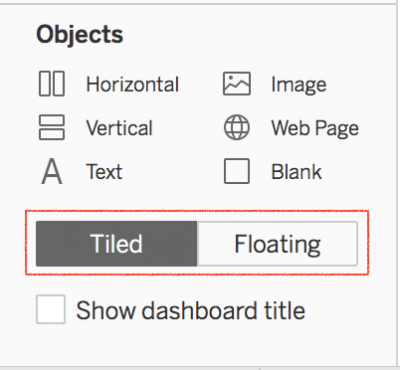
Floating enables you with a higher degree of flexibility. This is good for specific placing of legends, filters, images, etc. The caveat is, that if you change dashboard size, floating objects might not adjust the way you expect them to. Floating objects will, potentially, move on top of your other worksheets etc.
Tiled objects in general size better for your needs – meaning that it is easier to predict and the control their position on the dashboard across multiple screens. However, this does not imply, that you can forget all about the Laptop/Mobile First-approach. Adjusting to smaller views than creation will continue to cause problems like the example you see below:
Initial Dashboard Size

Going to Smaller Size than Initial Creation
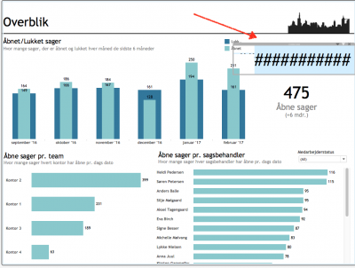
When using a Automatic- or Range-sized dashboard – i.e. if you want to resize them to fit different screen-sizes – you often obtain the best result by applying the tiled approach. If you are only working with Fixed-sized dashboards, you should go on and use floating.
Lastly, we tend to float legends and images, as these can be difficult to place as tiled. If you do this, be aware of the potential unwanted object-behavior when users switch to other devices/sizes.
***Performance Hint: ***
It has been shown, that in many cases floating dashboards tend to be superior to tiled dashboards with regard to performance. This is an important aspect to bear in mind.
5) Layout Containers – Horizontal & Vertical
Layout containers are objects that can be used to group/keep objects together – either besides each other or on top of each other. Containers keep your worksheets in a more fixed and identical scale.
Containers too, are set as Tiled or Floating – having the same advantages and disadvantages as mentioned earlier. By the same reasoning, these are of use when working with automatic- or range-sized dashboards, which we want to be scalable.
Select Container Type
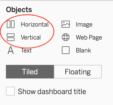
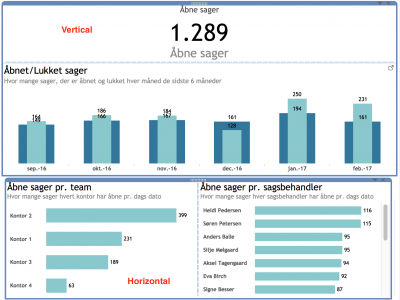
Below is shown how the containers can be used to place worksheets next to each. The dotted blue line indicates the separation of the individual sheets within the container in the bottom of the picture:
Vertical and Horizontal Containers
Hint: *If you want to select the container that your worksheets are placed within, double-click the dotted area marked in red below. This will automatically reselect the container of the sheets instead.
*
Double-click the Worksheet Within Horizontal Container

Total Horizontal Container Selected

6) Fitting of your worksheets – Some Good Advice
When working with sheets containing tables/lists of information, it is not a good idea to fit Entire View. The reason is, that when you switch to a smaller size, you will often end up with something on your dashboard looking like this:
Table Fitted Entire View

Instead, you should choose *Fit Width* only. This will of course result in a scrollbar, but it is still to be preferred to what you see above.
##### **7) Building Phone- and Tablet-sized Dashboards**
When you are building dashboards in tablet or phone size, it can be beneficial to use Fit Width and adjust only the height of the dashboard. Hereby creating what is often referred to as a long-format dashboard.
This enables the user to utilize the scroll-functionality of the phone- or tablet. When working with a long-format dashboard, it can be very beneficial to use a tiled vertical container and fix the height of the worksheets within it. In this way, you can change the height of the dashboard later on, without damaging the layout of the sheets in the container, that you just spend time to create.
Fixed Height of Worksheet Within Tiled Vertical Container

No Change of Layout Despite Adding New Sheet to Container

This can potentially also be applied to laptop- or desktop-sized dashboards. Again, if you are interested in long-format dashboards for tablet or phones, watch this wonderful introduction: [https://www.youtube.com/watch?v=z3Il57LrEwg&t].
