
Stacked bar charts are great and Tableau makes it really easy to label the different parts of the chart. But sometimes the partitions get too small to show labels without overlapping. By default Tableau removes labels so we avoid overlapping labels but this solution is not always satisfying.
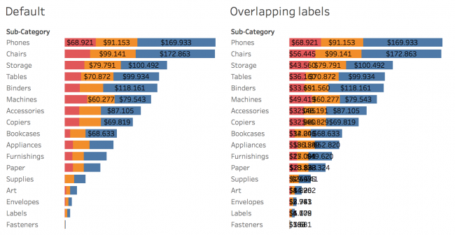
Here is four alternatives to the standard “show only-the-labels-that-fit” solution
1. Totals and one measure in tooltip
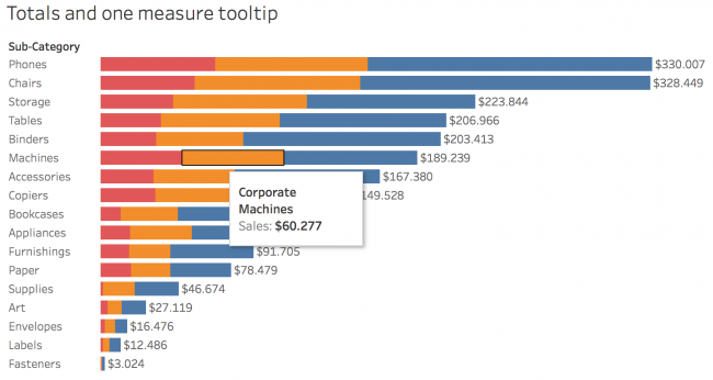
This is a simple and elegant solution to the problem at hand. Instead of labeling all the partitions of the bar chart we can instead just label the end of the bars. This way we can easily read the length of the bars and by adding the measure in the tooltip the end user can look up the values of the partitions if needed.
This solution is created as a standard stacked bar chart, but with a reference line per cell, showing the average of the measure. The reference line is just showing value as the label and the line option is set to none.
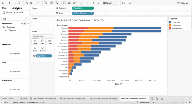
#### 2. Totals and multiple measures in tooltip
This solution is similar to the first, but sometimes you want to be able to see the values for the different partitions of the bar at the same time. This can be done with multiple measures in the tooltip

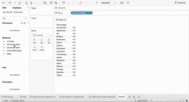
This solution requires calculating the different partitions, stacking the calculations to a stacked bar chart and putting the calculations in the tool tip.
The calculations (in this case one for each segment) all follow the same pattern:
IF [Segment] = "Consumer" THEN [Sales] END

IF [Segment] = "Corporate" THEN [Sales] END

IF [Segment] = "Home Office" THEN [Sales] END
These three new measures are now used to build a stacked bar chart and also placed on the tooltip.
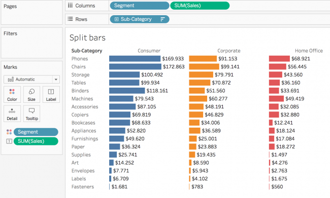
#### 3. Split bars Another cool solution is to create a split bar chart instead of a stacked. By splitting the bar chart there is no longer an issue with partitions being too small for labels or labels overlapping. The sorting can still be done on sum([Sales]) for each Sub-category, resulting in the same sorting as in the stacked bars.
#### 4. Split labels on stacked bar chart If a stacked bar chart with all labels visible at all time and labels not overlapping is all that you want, there is of course also a solution for that in Tableau. By utilizing a dual axis chart its possible to create a stacked bar chart with all the labels placed needly at the end of the bars.
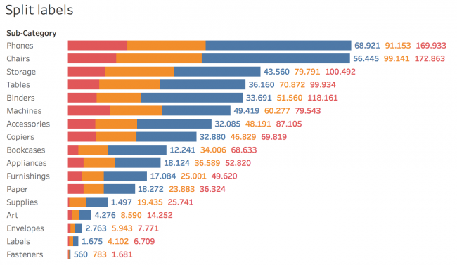
Solution:
- Create a dual axis chart of Sub-category and 2 x Sales.
- On the marks card define one of the sales measures as a bar chart and the other one as a shape.
- Color the bar chart by segment.
- The shapes should have 0% transparency (found under color) and make the mark size as small as possible.
- Place all three calculations from 2. on label for the shapes.
- Click on Label and format the label so you have all three fields next to each other and color code them according to the colors on the stacked bars.
- Create a calculated field for 1,5*[Sales].
- Add a reference line using this calculation. The reference line should be for the entire table, have no label and no line.
- This reference line ensures that the axis is extended so the labels are placed outside the bars, even for the longest bars.
[Download the workbook](https://media.inviso.dk/2017-03-15/14895798277b43dfd5fd932d54834c01a577b0d17f.twbx)

