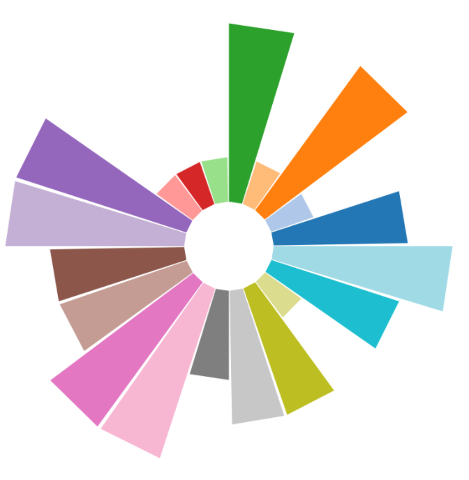
Tableau has some really nice standard visualizations which are intuitive and easy to create. If you want to defer from the standard options however, it can quickly become more tricky. Today we would like to show an example of how we can use polygons to create some amazing visualizations.
We are trying to create a sunburst chart! It shows the same information as a bar chart, but instead of having everything nicely on a horizontal axis, we are showing a circular axis.

The Alteryx part
For this visualization, we create a macro, which can be downloaded here(sunburst macro.yxmc). We are using some mockup results of a survey (which can be found here(mockup data.xlsx)), which consists of 10 respondents where each has answered 20 different questions. They’re scaled from 1 to 4, where 1 is the lowest and 4 the highest. Our sunburst chart will show a bar for each question, where the highest bar indicates a 4, and the lowest bar indicates a 1.
There are some considerations for the data due to the way we structured the visualizations. If someone answers a 4 on a question, there will be only a small square in the visualization. We have to tell Tableau that someone with an answer 4 also satisfied answer 1, 2 and 3. We do this in Alteryx, with the generate rows tool and append fields.
The macro to generate the layout of the visualization requires three inputs: number of groups, number of shapes, and the radius. The number of groups represents, in this case, the number of questions in our survey, They will, in the end, show up in individual bars in Tableau. The number of shapes shows the number of possible answers for our survey, in this case 4. The last input is the radius. This one can be fine- tuned based on the number of groups, number of shapes, and the desired size of the sunburst chart in Tableau. For now, we will stick with a radius of 500.
We will combine the survey results and the output of the macro into Tableau.
The Tableau part
Before we start putting the data into Tableau, I’d like to explain what we are trying to achieve. We are making polygons, which means that we are using Tableau’s canvas as a grid where we plot figures based on their coordinates. In our case, every figure consists of 5 points: a point for each corner and a duplicate point to make the figure complete. We can tell Tableau to combine the points, by assigning a common id for these points, which we use to connect the dots! Here is an example of how this works:
After loading in both the data, we need to make an inner join on Group ID (source: Macro) on Question ID (source: Survey), and on Single Shape ID (Source: Macro) and Answer (Source: Survey).
Now we have to accomplish the following steps to create the visualization:
- Select ‘Polygon’ as the graph type
- Drag ‘X’ to rows and ‘Y’ to columns
- Drag ‘Respondent ID’ to filter, and choose a respondent of choice
- Drag ‘Group ID’ to Details and ‘Point ID’ to Path
You should be seeing something which looks like a sunburst chart already.
To make it a bit nicer, the following steps can be applied:
- Change ‘Group ID’ from Details to Color
- Remove the gridlines and zero lines in the Format Lines pane.
- Fix both axes to -550 to 550 (if you’ve used a radius of 500, otherwise adjust accordingly)
- Hide both the axes, put your visualization in a dashboard, add some other information and some custom actions.
