You just got access to your dataset and you are ready to start spraying out cool analytics. Especially if you have a good idea about how your data is looking, it is tempting to skip exploring the data before diving head first into it.
Alteryx is full of tools that make an EDA(Exploratory Data Analysis) too easy to skip. By just spending 5 minutes looking into your data you might find errors or relations in your dataset that you would otherwise have missed. This is meant as a basic guide to a quick and general EDA and hopefully helps you avoid getting lost.

An EDA will help you:
- Find missing data, wrong data types and data sizes
- Find outliers that might or might not be explainable
- Find new relations between parameters
- Find general trends in the data
Keep it simple – use the result window
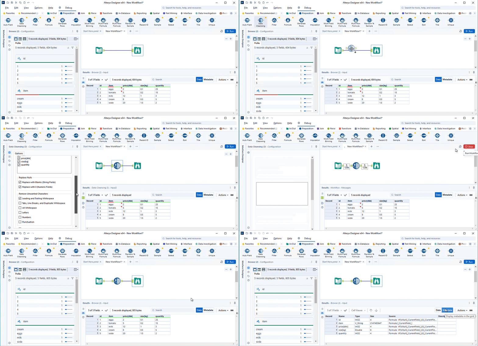
The result window is always in your view and is a great way to quickly check your data. In the results window, the data quality bar can be viewed above each column. Colours indicate what percentage of the column contains OK values(green), empty values(Grey), Null values(yellow), and not OK values(red). The specific meaning of each colour can be seen here. The Data Cleansing tool is great at cleaning your data. Insert this tool to remove leading or trailing white spaces, remove null rows and columns, and for other quick cleaning methods.
Clicking the ‘Metadata’ button in the result window will show you the datatype, size, source, and description of each column. A too small column size or wrong datatype will mess with your analysis sooner or later; make it a habit to check this as the first thing. To quickly change these values use the Select tool.

Browse Tool – Data Profile
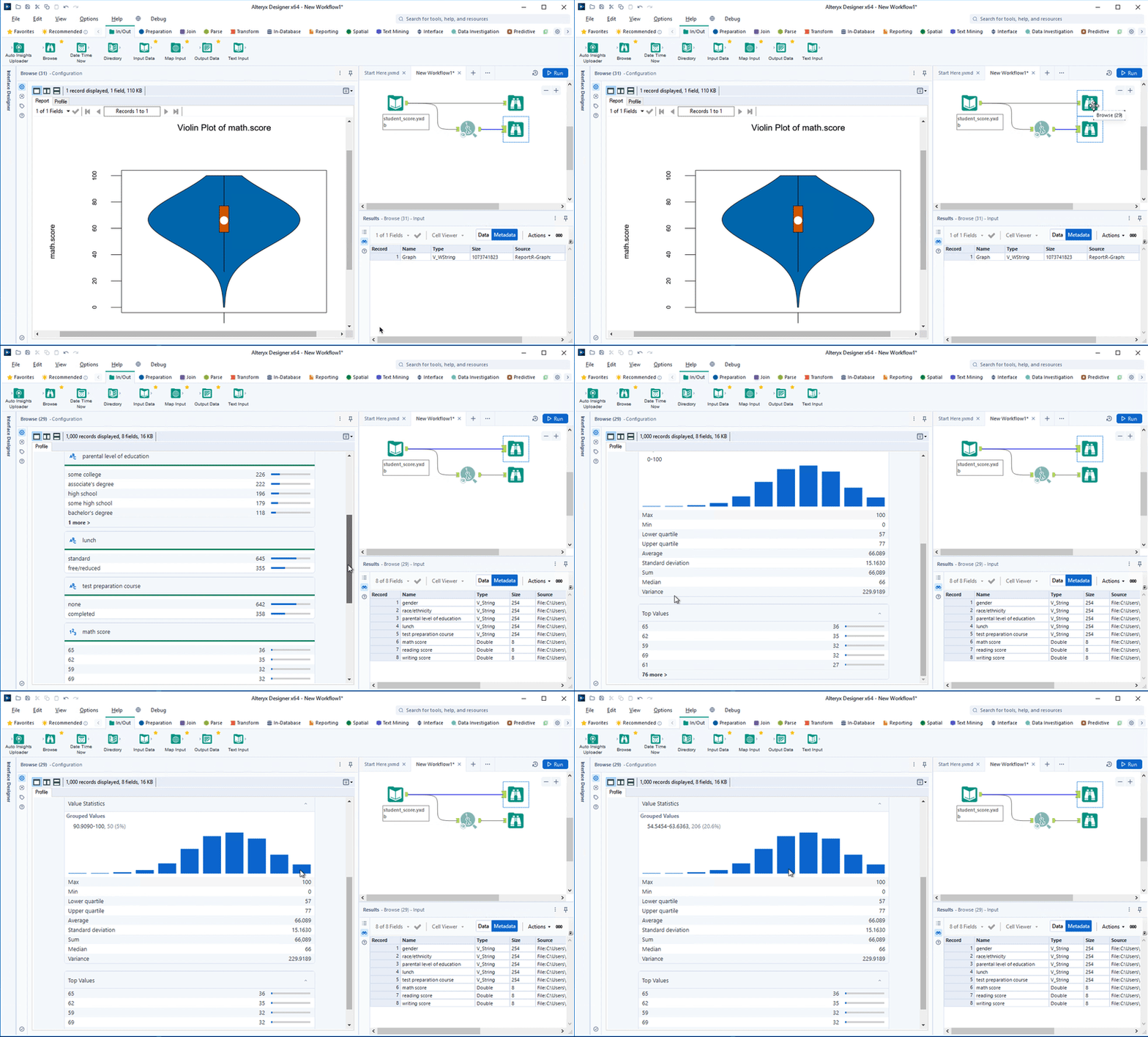
Probably the most used tool in Alteryx for a reason. Apart from looking at the actual data points themselves, the browse tool is great at giving an overview of your data. In the Browse tool configuration window, a profile of the data is available. The data quality bar is also available here together with the distribution of values in each column. By clicking on the name of a column in the configuration window, a more detailed profile of the specific column will appear. Depending on the datatype different statistical values such as mean, standard deviation, max, min, average, shortest value, longest value, ect will be displayed. Here it is easy to check whether the min, max and other values make sense and to further investigate if they don’t. The view will also give you a histogram of your data. Maybe you can find a nice bell curve somewhere in your data. For a fancy histogram, a violin plot can be generated using the ‘Violin Plot’ tool.

Other tools in the Data Investigation category that will help you gain similar insight are Basic Data Profiling, Field Summary, and Frequency Table.
Look at the numbers

Looking at insight for individual columns is important, however, seeing how different columns relate to each other can be just as insightful. With the Association Analysis tool, a correlation matrix can easily be generated for numerical columns. Here a correlation coefficient close to 1 indicates a high positive correlation, 0 indicates no correlation and a correlation coefficient close to -1 indicates a high negative correlation. If you are using your data for data modelling you might have to remove columns that are correlated to improve the model and reduce the overall complexity. To figure out how to reduce the dimensionality of your data multiple methods can be used, some of them can be found here.

For correlated columns, the Scatter Plot tool can be used to gain a quick visual insight into how the values are correlated and general trends in the data. You might find that parameters that you thought would be linearly correlated are actually exponentially correlated. In the scatter plot it is possible to visually detect outliers. Many definitions of outliers exist, with one of them being a point that is more than 3 standard deviations away from the mean. The standard deviation and mean for a column can be found with the browse tool. Whether data points should be removed depends on the specific case, however, it should always be justified in the analysis.

By just spending five minutes adding a few tools to your workflow you will easily be able to find insights that you might otherwise have missed and avoid frustration further into your analysis. The methods discussed are all a part of a simple EDA, with more advanced EDA methods existing. However, for most cases the tools discussed should be more than enough to clean your data and find new insights, enabling you to make an efficient and thorough analysis.
When you run into problems make sure to visit the Alteryx Community where it is almost certain that someone else has had the same problem as you. If you have any questions or comments please reach out to me.